
In today’s digital landscape, creating a website that delivers a seamless user experience (UX) across multiple devices is crucial.
With over 50% of global website traffic generated from mobile devices in 2022, responsive web design (RWD) is no longer optional but a necessity.
This blog post covers key aspects of RWD, helping you to build a website that adapts to various screen sizes, resolutions, and devices.
1. The Importance of a Mobile-first Approach in Responsive Web Design

Adopting a mobile-first approach ensures your website is designed for optimal performance on mobile devices before scaling up to larger screens.
According to Google, mobile-first websites have a higher chance of ranking well in search results, as 70% of users are more likely to engage with mobile-friendly websites.
2. Fluid Grids: The Backbone of Responsive Layouts
Fluid grids allow your website layout to adapt to different screen sizes by using relative units (like percentages) instead of fixed units (like pixels).
This flexibility results in better UX, as 61% of users won’t return to a site that’s difficult to navigate on mobile.
3. Flexible Images: Keeping Visual Content in Proportion
Ensuring your images scale proportionally with screen size prevents them from breaking your layout or impacting load times.
A study by Adobe found that 39% of users will stop engaging with a website if images take too long to load.
4. CSS Media Queries: Defining Breakpoints for a Responsive Design
CSS media queries allow you to apply different styles based on specific device characteristics, such as screen width or resolution.
This helps create a seamless UX across various devices, as 88% of users are less likely to return to a website after a bad experience.
5. Breakpoints: When and How to Use Them
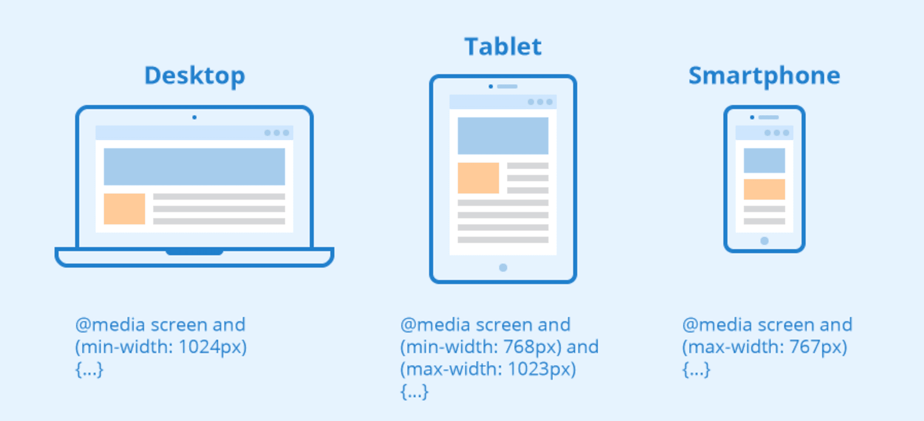
Breakpoints are strategically placed points where your website’s layout changes to adapt to different screen sizes.
By tailoring breakpoints to your target audience’s devices, you can ensure that 74% of users who are more likely to return to mobile-friendly sites have a seamless experience.
6. Typography: Maintaining Readability Across Devices
Optimizing typography for different devices ensures text remains legible and accessible. This is crucial, as 69% of users spend their media time on smartphones.
7. Performance Optimization: Faster Load Times and Better UX
Optimizing your website’s performance, including image compression and minimizing HTTP requests, can significantly improve UX.
According to Google, 53% of mobile users abandon a site if it takes longer than 3 seconds to load.
8. Accessibility: Designing for All Users
Ensuring your website is accessible to users with disabilities is not only a moral obligation but also has legal implications.
In fact, 71% of users with disabilities will leave a site if it’s not accessible.
9. Progressive Enhancement: Building a Robust and Future-proof Website
Progressive enhancement focuses on building a website with basic functionality first and then adding advanced features for capable devices.
This approach ensures a functional and usable website for 94% of users, even on older devices or browsers.
10. Cross-Browser Compatibility: Ensuring a Consistent UX Across Browsers
Achieving cross-browser compatibility is crucial to providing a consistent UX, as users access your website from various browsers with different rendering engines.
According to Statista, 64% of users globally use Google Chrome, while 19% use Safari.
11. Design Patterns: Adopting Proven Solutions for Common Problems

Leveraging established design patterns can help you create a responsive website that meets user expectations.
A well-organized layout, clear navigation, and concise content can significantly improve UX, as 79% of users prefer to scan web pages rather than read word-for-word (Nielsen Norman Group).
12. Responsive Frameworks: Streamlining Your Development Process
Using responsive frameworks like Bootstrap or Foundation can simplify and accelerate your development process.
These frameworks come with pre-built components and a grid system, allowing you to create a responsive website with ease.
13. Testing and Debugging: Ensuring a Seamless User Experience
Regular testing and debugging are essential to guarantee a smooth and consistent UX across different devices and browsers.
By using tools like BrowserStack or Google’s Mobile-Friendly Test, you can identify and resolve issues early in the development process.
Studies show that fixing a software bug after development is 30 times more expensive than addressing it during design (IBM).
14. Continuous Improvement: Keeping Your Responsive Website Up-to-Date
As technology and user behavior evolve, it’s crucial to continuously update your website to maintain a seamless UX.
Regularly reviewing analytics, gathering user feedback, and staying informed about industry trends can help you make data-driven decisions to enhance your website.
Frequently Asked Questions
What is a responsive website design?
Responsive website design is an approach to web design aimed at making websites provide an optimal viewing and interaction experience across a wide range of devices. This means that a responsive website should look and function well on a desktop computer, a laptop, a tablet, or a smartphone.
With responsive design, the layout and content of a website automatically adjust to the screen size and resolution of the device it’s being viewed on.
What are the 3 components of responsive web design?
The three key components of responsive web design are:
- Fluid Grids: This involves designing the layout of your website in terms of proportions rather than fixed pixels. As the screen size changes, the grid and the elements within it resize in relation to one another.
- Flexible Images: Also called adaptive images, these are images that scale and change their position based on different screen sizes. This ensures that images look good and do not overlap with other elements of the site.
- Media Queries: These are CSS techniques that apply different style rules to different devices based on characteristics like screen size and resolution. They allow designers to change the layout and content of a site at specific breakpoints.
How do I make my website fully responsive?
Making a website fully responsive involves several steps:
- Use fluid grids: Design your layout in percentages rather than fixed pixels to ensure that your website scales proportionately when viewed on different screens.
- Use flexible images: Ensure that your images can scale without distortion to fit within its container element.
- Use CSS media queries: These allow you to apply different styles and layouts to your website based on the viewer’s screen size.
- Design for mobile first: Start designing for smaller screens and then add additional features for larger screens. This approach can help improve performance on mobile devices.
- Test on different devices: Use various testing tools to check how your website looks and functions on different devices and browsers.
What is the easiest way to have a responsive web design?
The easiest way to have a responsive web design is to use a responsive framework or a content management system (CMS) with built-in responsive themes. Frameworks like Bootstrap or Foundation provide pre-made grids and components that adapt to different screen sizes. CMS platforms like WordPress also offer a variety of responsive themes that automatically adjust your website layout based on the viewer’s device.
What are the top 10 reasons to use responsive web design?
- Increasing Mobile Usage: More people are using mobile devices to access the web. A responsive design ensures a good user experience on all devices.
- Improved User Experience: Responsive design ensures your website is easy to navigate and use, regardless of the device.
- Better SEO: Google has stated that responsive web design is a ranking factor, due to the improved user experience it provides.
- Lower Maintenance: A single responsive website requires less upkeep than maintaining separate mobile and desktop versions of your site.
- Cost-Effective: It’s more cost-effective to design and maintain one responsive website than separate sites for different devices.
- Consistency in Design: A single responsive site ensures brand and design consistency across all devices.
- Increased Conversion Rates: A responsive site can lead to a better user experience, which can result in higher conversion rates.
- Faster Website Load Times: Well-implemented responsive design can lead to faster load times, especially on mobile.
- Future-Proof: Responsive websites can work well on new, upcoming devices without the need for a redesign.
- Competitive Advantage: Having a responsive website can give you an edge over competitors who don’t.
Conclusion
As technology continues to advance and the number of devices, screen sizes, and resolutions increases, responsive web design will remain a critical aspect of providing an optimal user experience.
In addition, emerging technologies like foldable devices, smartwatches, and augmented reality will further drive the need for adaptable and versatile web design solutions.
By staying current with the latest design trends and continually updating your knowledge, you can ensure your website remains relevant and user-friendly.
As more businesses recognize the importance of responsive web design, the demand for skilled designers and developers will grow, opening up new opportunities for professionals in the field.