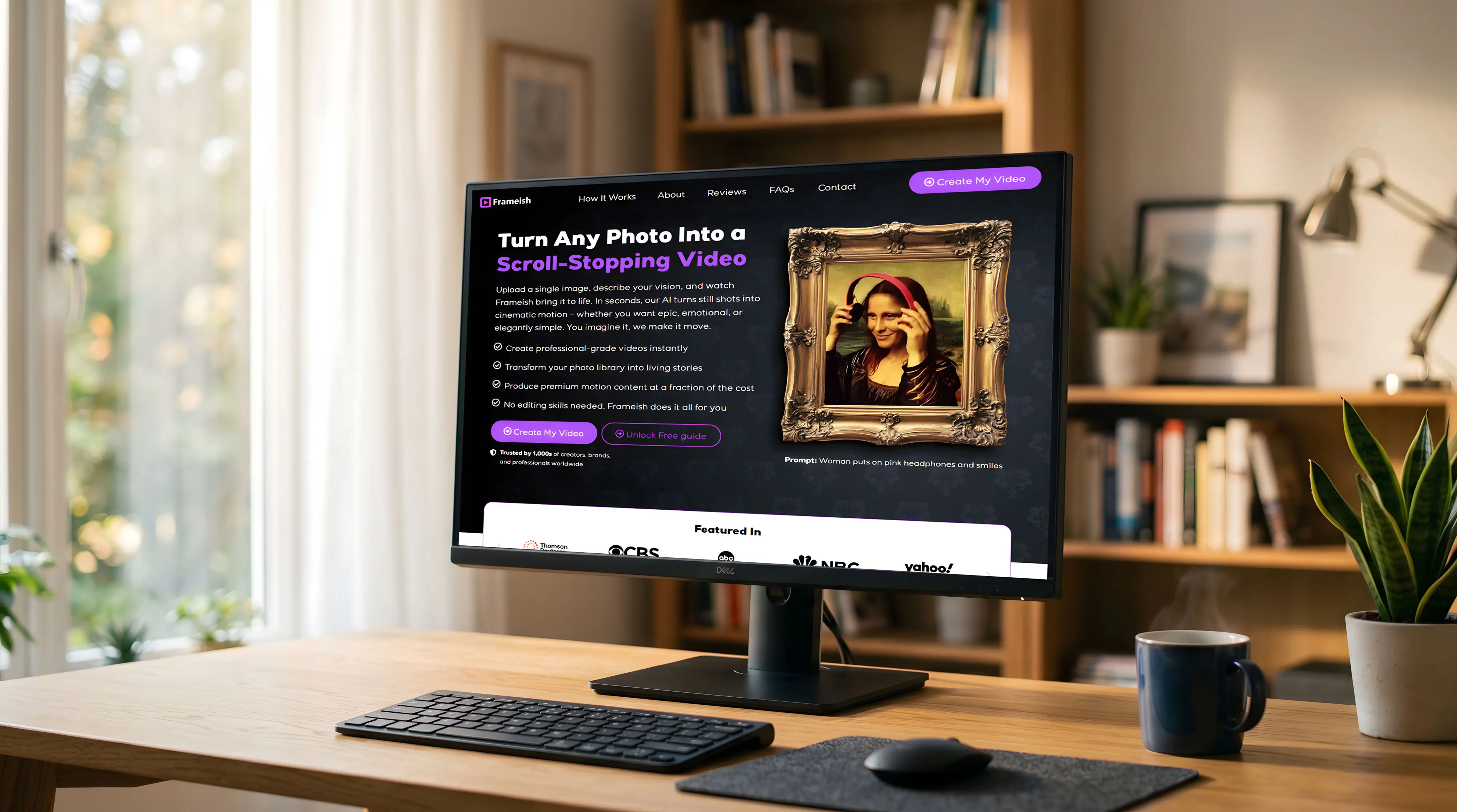
Frameish came to us with a genuinely exciting AI product: a tool that turns any still photo into a cinematic, scroll-stopping video in seconds. Upload a photo, describe the motion you want, and the AI handles the rest. No editing software. No technical skills. Just results.
The product was real, the technology worked, and early users loved it. What they needed was a marketing website and a web app interface that could explain a brand-new concept quickly, earn trust instantly, and convert curious visitors into paying subscribers. We built both – a high-converting landing page and a full-featured web app UI – using our web design and development process, from the ground up.
Frameish faced a challenge that’s unique to AI startups: the product is impressive, but explaining it is hard. You can’t just write “turns photos into videos” and expect people to believe it – they need to see it to believe it, and they need to understand exactly why they’d want it before they’re willing to pay.
The original direction was a basic SaaS template – clean, functional, but generic. It didn’t communicate the magic of the product. There was nothing to make a visitor stop and think: this is different. We needed a site that led with wow, validated the product’s credibility, and walked first-time visitors through exactly how Frameish works – all without losing them before they hit the first CTA.
Our landing page design service was applied to Frameish with one core job: get skeptical visitors from “what is this?” to “I want to try this” as fast as possible.
The hero section does the heavy lifting. A dark, immersive background sets the premium AI-tool tone, while the headline – “Turn Any Photo Into a Scroll-Stopping Video” – speaks directly to what content creators and marketers actually want. The animated product demo (the Mona Lisa with headphones) runs right in the hero, so visitors see the output before they read a single word of copy.
Below the fold, the site builds trust methodically: press mentions (CBS, NBC, Thomson Reuters), a three-step “How It Works” explainer, feature benefit grids, a live demo embed, and a pricing structure that makes the first step feel risk-free. Every section feeds the next, building confidence and removing objections as the visitor scrolls.
Content creators live on mobile. Whether they’re posting from their phone or browsing new tools between tasks, the Frameish experience needed to work flawlessly on a small screen.
We rebuilt every section for mobile-first consumption. The dark hero stacks cleanly with the animated demo front and center. CTAs are thumb-friendly. The “How It Works” steps collapse into a vertical scroll that’s easy to follow. Feature sections reformat into single-column reads that keep visitors moving down the page without losing the visual hierarchy that makes the desktop version so effective.
The web app was designed to feel as simple as the product promise. No dashboards cluttered with settings. No learning curve. Just upload, describe, generate.
The app interface opens directly to the creation screen: a drag-and-drop upload area on the left, and a motion style selector on the right with eight clear options – Zoom In, Zoom Out, Pan Left, Pan Right, Dolly Forward, Cinematic, Handheld, and None. A natural-language prompt field lets users describe exactly what they want to see. One click: Generate Video.
The “My Videos” library view lets users manage, download, upscale, or add watermarks to every video they’ve created – with a clean grid layout that makes the output feel like a professional creative library.
This project was a full-stack brand and product build:
Next Case Study
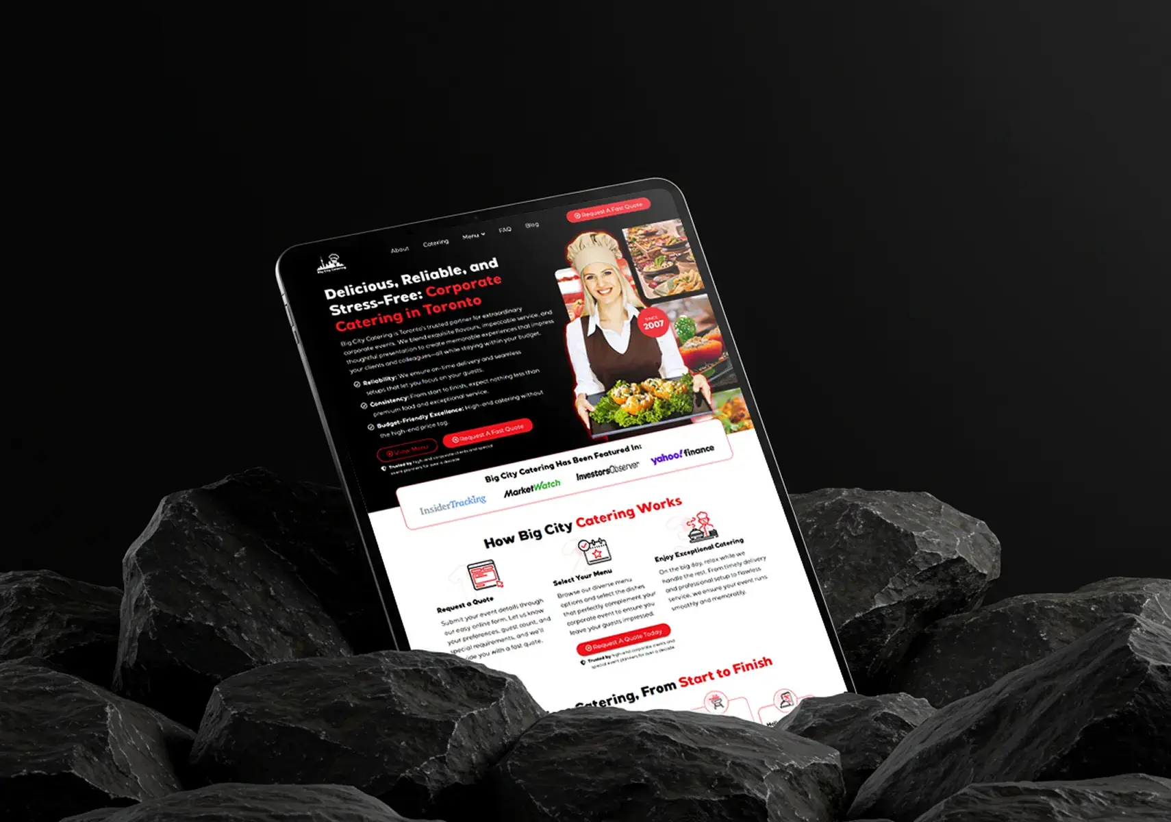
Big City Catering came to us with great food, a passionate team, and a website that was holding them back. Houston’s corporate catering market is competitive – businesses booking catering for events need to feel confident fast. Their old site wasn’t making that impression.
Real tactics, zero fluff. Unsubscribe anytime.
Your details. Our expertise. Free consultation. No obligation. Zero risk. Why wait?