
In this article, we will delve into the essential principles of web design, covering topics such as visual elements, grid systems, and mobile compatibility, arming you with the knowledge to create stunning and effective websites.
The Importance of Web Design Principles
As the digital world continues to evolve, the significance of web design principles cannot be overstated.
These principles are essential for creating aesthetically pleasing websites, optimizing user experience, and boosting conversion rates.
By effectively combining content, navigation, and visuals, web designers can achieve an optimal balance, reinforcing a brand and making it stand out in the crowded online landscape.
An effective web design is paramount for creating a positive initial impression and fostering future interactions with the brand.
In addition, it serves as a visual representation of the brand’s identity, mission, and industry position. A well-crafted website can be beneficial for search engine optimization efforts, defining the website’s purpose and guiding the design and content creation.
Understanding the target audience’s demographics and needs helps determine the right direction for the site.
Keeping up with the latest trends and concepts in web design principles ensures that the website remains fresh, captivating, and allows users to interact with the website seamlessly.
Visual Elements in Web Design

Visual elements, including images, icons, and colors, play a crucial role in creating an engaging and visually attractive website.
These elements not only enhance the overall aesthetics of a site, but also help communicate ideas more quickly than text, making it easier for elements users to process information.
In the following sections, we will delve deeper into the importance of images and icons, as well as the impact of color choices on brand identity.
Images and Icons
High-quality images and icons are integral to web design, as they contribute to an aesthetically pleasing website that is easy to navigate and comprehend.
They can aid in establishing a consistent brand identity and draw attention to essential elements on the page.
To effectively incorporate images and icons into web design, it is recommended to use relevant, high-quality images, optimize file sizes for faster loading times, prioritize original images, and leverage icons to help users process information more efficiently.
An excellent example of effective use of image backgrounds in website design can be seen in e-commerce brands that aim to display their products.
For instance, the landscape photography featured in the Subaru website design is strategically used to evoke a sense of adventure and help the user envision how they could utilize their new vehicle.
By carefully selecting and incorporating images and icons, designers can create a visually appealing website that caters to the user’s needs.
Colors and Brand Identity
Color choices play a vital role in web design, as they can be utilized to strengthen brand recognition and elicit emotional responses from website visitors.
When deciding on colors for a website, it is essential to consider how they communicate the website’s identity and make the content legible.
By running color combinations through a color contrast checker, designers can verify the readability of their chosen colors and ensure a visually appealing design.
Complementary colors can be employed in web design to emphasize key elements and form a distinct visual identity for the brand.
These colors, when combined effectively, can create a harmonious and visually engaging design that resonates with the target audience and reinforces the brand’s identity.
Establishing Visual Hierarchy
Visual hierarchy is the strategic organization of content to create a logical flow for the user, providing them with a comprehensive experience on the website.
It is essential for structuring content and providing users with a navigational guide through the website.
By employing the ‘Z’ and ‘F’ patterns, emphasizing important parts of the website, and utilizing visuals to add energy to the design, designers can create a visually appealing layout that guides users through the site and enhances their overall experience.
To achieve a successful visual hierarchy, designers must prioritize the most critical information and minimize distractions.
This can be done by emphasizing essential content, using white space to create a sense of balance and harmony, and strategically placing elements to guide the user’s eye.
By understanding how the human eye perceives objects, designers can create a visually appealing and functional layout that caters to the user’s needs.
The Power of Negative Space

Negative space, also known as white space, refers to the empty areas between visual elements in a design.
It is employed to balance the page’s design, organize the content and elements, and enhance the visual experience for the user.
For instance, Apple effectively utilizes negative space in their web design to create a clean and minimalist layout that focuses on the product and its features.
Incorporating negative space into web design can result in a neat, uncluttered, and legible site.
It can direct the user’s focus and create a feeling of equilibrium and concordance in the design. By strategically using negative space, designers can improve the readability of their site and create a visually appealing layout that keeps users engaged.
Consistency in Site Design
Maintaining consistency across all pages of a website is crucial for establishing a polished and professional appearance, thereby enhancing brand credibility.
Consistency in web design relates to maintaining uniformity throughout a website, including elements such as fonts, colors, and layout. This serves to provide structure for the viewer and enhances the usability of the website.
To ensure consistency and engagement in web design, designers can incorporate various elements, such as varying fonts and colors for headings or altering the layout of different pages.
By maintaining a consistent design throughout the website, users can easily navigate the site and feel more comfortable interacting with the content.
Understanding Your Target Audience

In order to create a website that stands out amongst the competition, designers must communicate to their audience through design.
Tailoring web design to the preferences and needs of the target audience ensures a personalized and engaging user experience.
Designers must consider the values, goals, and priorities of their target audience in order to develop a website that caters to their needs and captures their interest.
By gaining an understanding of the user’s requirements and crafting a website to fulfill those requirements, designers can create a site that is both informative and captivating.
In doing so, businesses can reach a broader audience and deliver a user experience that is tailored to the needs of their target market.
User Interface and Navigation
User interface design and effective navigation are essential for allowing users to easily interact with and explore a website.
A study conducted by Clutch revealed that 94% of participants consider website navigation the “most important website feature”.
Designing a website that is both intuitive and easy to navigate is crucial for ensuring a positive user experience.
To achieve effective website navigation, it is essential that it is easily locatable, compatible with all devices, and not inundated with numerous options.
By establishing a logical page structure and hierarchy, as well as providing distinct labels and links, designers can create a user-friendly website that enables visitors to find the information they need quickly and efficiently.
Design Elements for a Visually Appealing Website

Various design elements contribute to creating a visually appealing website, such as typography, contrast, and harmony.
Typography is essential in web design, as it can effectively communicate the brand’s personality and capture the audience’s attention.
By selecting the right fonts and typefaces, designers can create a visually engaging layout that is both informative and captivating.
Contrast and harmony are also crucial components of a visually appealing website design.
By utilizing contrasting colors and design elements, designers can create a layout that is visually engaging and easy to navigate.
Similarly, creating a sense of harmony within the design can ensure that the content is presented in a visually pleasing and organized manner, resulting in a website that is both aesthetically appealing and functional.
The Web Design Project Process
The web design project process involves a series of stages, from planning and wireframing to development and testing.
By understanding each stage of the process, designers can create a website that meets the desired purpose and captures the interest of the audience.
Planning is the first stage of the web design process, involving the identification of objectives and establishing the scope of the project.
Wireframing is the next stage, where designers create a visual representation of the website’s layout and structure.
Development involves building the website’s technical components, while testing ensures that the site functions properly and meets the defined objectives.
By following this process, designers can create a visually appealing and effective website that caters to the needs of their target audience.
Harnessing White Space
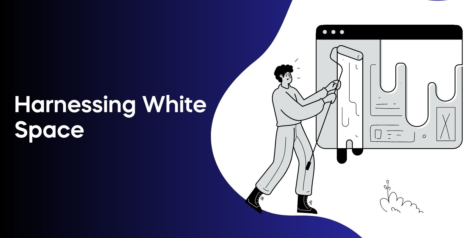
White space, or negative space, is a powerful design tool that can be used in web design to create a clean, clutter-free, and easy-to-read site.
By using white space strategically, designers can create a visually appealing layout that enhances the readability of the site and allows users to focus on the most important content.
Incorporating white space into web design can result in a neat, uncluttered, and legible site. It can direct the user’s focus and create a feeling of equilibrium and concordance in the design.
By strategically using white space, designers can improve the readability of their site and create a visually appealing layout that keeps users engaged.
Focused Web Design Principles
There are specific web design principles that are crucial for creating an effective website, such as simplicity, purpose, navigation, visual hierarchy, content, and user-centered design.
Simplicity in web design refers to the concept of creating a website that is straightforward and easy to use, emphasizing the user experience.
Purpose is vital in web design, as it involves developing a website that captures the interest of the audience and meets its desired purpose.
Navigation is essential for constructing a website that is both intuitive and easy to traverse, while visual hierarchy involves arranging elements on a website in a way that is aesthetically pleasing and easy to comprehend.
Content is paramount for constructing a website that is both informative and captivating, effectively communicating the brand’s identity and mission.
Lastly, user-centered design is a process of designing a website to cater to the needs of the user, ensuring a pleasant experience when users interact with the website.
Designing for Web and Mobile Compatibility

Designing websites that are both desktop and mobile-friendly is crucial, as smartphones are increasingly becoming the primary means through which people access content.
Creating a website or application that is optimized for both desktop and mobile devices is essential for providing a consistent user experience across different screen sizes and resolutions.
By developing a responsive layout, avoiding the use of Flash, and ensuring the website is mobile-friendly and easy to navigate, designers can create a website that caters to the needs of users on both desktop and mobile devices.
This can result in a consistent user experience across devices, potentially leading to increased user engagement and satisfaction.
Additionally, businesses may be able to reach a broader audience, as more people are accessing content on mobile devices.
The Role of Human Motor System in Web Design
Understanding the human motor system can inform web design decisions, improving usability and user satisfaction.
Fitt’s Law, which states that the time required to move to a target area is dependent on the distance to the target and the size of the target, can be applied to web design.
For optimal user experience, elements that are intended to be easily selectable, such as primary calls-to-action, should be of considerable size and located close to users.
By leveraging Fitts’s Law to improve the user experience, designers can provide ample spacing between targets and place them near the user’s likely prior location, resulting in a more intuitive and user-friendly website.
Grid Systems in Web Design

Grid systems in web design are a structured layout of intersecting horizontal and vertical lines that are used as guides for positioning and aligning elements in a website’s composition.
Using grid systems can promote consistency and organization in design, which can be especially beneficial when there is a lot of content.
An exemplary illustration of a website utilizing a grid-based layout is showcased in this Elementor blog post featuring various inspiring designs.
Grid systems can help designers create visually consistent and orderly layouts that are both visually appealing and functional.
By incorporating grid systems into their design process, designers can improve the overall aesthetics and usability of their websites.
Breaking Text into Manageable Chunks
Dividing text into smaller, digestible sections is essential for improving readability and engagement on a website.
By breaking text into manageable chunks, designers can create a layout that is easier for users to read and comprehend, ensuring that users remain engaged with the content.
To achieve this, designers can use techniques such as bullet points, subheadings, and short paragraphs to break up long passages of text.
By incorporating these techniques into their web design, designers can create a visually appealing and easy-to-read layout that keeps users engaged and encourages them to explore the site further.
Balancing Symmetry and Creativity in Web Design
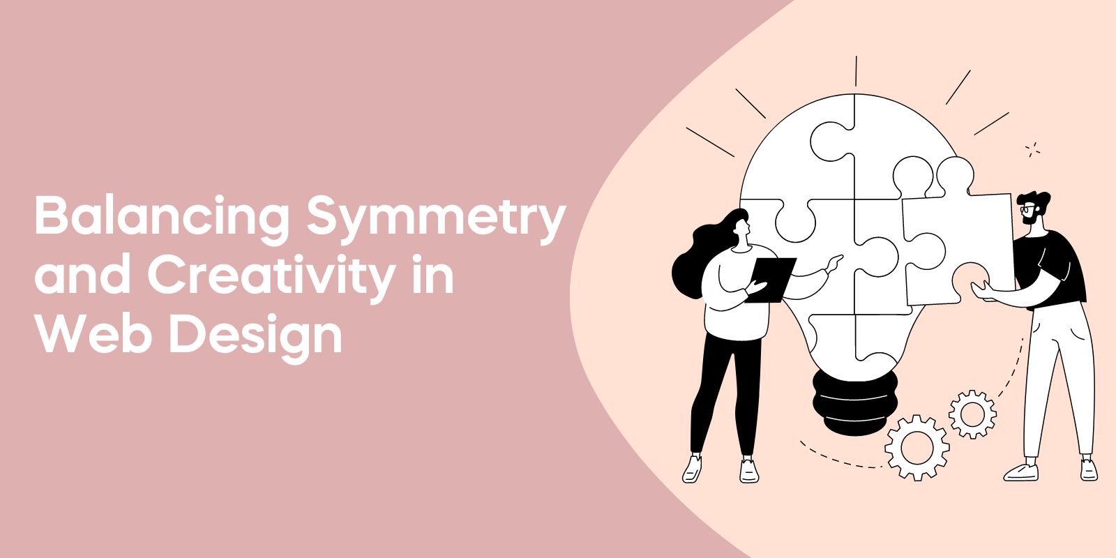
Achieving balance between symmetry and creativity in web design is essential for creating a visually appealing and harmonious layout.
Symmetry can be utilized to promptly create a website design that appears more balanced, organized, and professional.
However, it is also important to incorporate creative elements that make the design stand out and capture the attention of users.
Designers can achieve this balance by incorporating symmetrical elements in a creative way or introducing creative elements in a symmetrical layout.
By finding a balance between these two aspects, designers can create a visually engaging and functional website that caters to the needs of their target audience.
Invariance as a Design Principle
Invariance in web design is the inclusion of one distinct element among a homogenous group, which can be used to create a visual hierarchy on a web page.
By strategically placing invariant elements on a page, designers can draw users’ attention to critical information, improving the overall user experience.
To create a visual hierarchy using invariance, designers should arrange page elements in order of importance and adjust the size, color, and placement of each element until visitors’ eyes are drawn to each element in the desired sequence.
By utilizing invariance as a design principle, designers can create a visually appealing and functional layout that caters to the user’s needs.
Prioritizing User Experience
User experience is a critical aspect of web design that should be prioritized in order to create a website that is easy to navigate and meets users’ needs.
By focusing on usability and ensuring that the site is easy to navigate, designers can provide a pleasant experience for users when utilizing the website.
Customer journey mapping is an effective tool for gaining insight into user experiences when engaging with a product, and it can be leveraged to optimize user experience and achieve desired outcomes.
By understanding user preferences and ensuring that websites cater to their needs, designers can create a website that not only looks visually appealing but also provides a seamless and enjoyable user experience.
Frequently Asked Questions
What are the 5 basic principles of web design?
The principles of effective web design include usability, accessibility, aesthetics, functionality, and visibility. These five elements help to create user-friendly interfaces and experiences that meet the goals of the designer and users alike.
By taking the time to consider these aspects of design, designers can create successful websites that make browsing a pleasant experience.
What are the 7 guidelines for a successful web design?
Creating a successful web design requires following seven guidelines: selecting the right audience, making navigation easy, optimizing for mobile, incorporating visuals and multimedia, keeping text short and scannable, focusing on clarity and consistency, and providing value with every page.
By taking these into account, you can create a website that both looks great and functions perfectly.
What are the 7 common principles of design?
The seven common principles of design are balance, proximity, alignment, repetition, contrast, white space, and typography.
By utilizing these principles, one can effectively create aesthetically pleasing yet functional designs.
What are the principles of website design?
The key principles of website design focus on creating an effective, user-friendly interface and using complementary colors, font choices, imagery, readability, and layout techniques.
Additionally, following best practices to ensure a consistent user experience is essential for effective website design.
What is the importance of web design principles?
Good web design principles are essential for building effective, user-friendly websites that engage and retain customers. Adhering to fundamental web design principles is critical for crafting engaging websites that both look good and function well, thus helping businesses reach their online goals.
Conclusion
In conclusion, understanding and implementing web design principles is crucial for creating visually appealing websites that effectively engage users and meet their needs.
By focusing on visual elements, grid systems, mobile compatibility, and user experience, designers can create stunning and effective websites that stand out amongst the competition.
We hope that the knowledge and insights shared in this article will inspire you to apply these principles in your next web design project, ultimately leading to a more engaging and satisfying experience for your website visitors.