In depth look into Google’s Page Experience Update and SEO, along with the introduction of the Core Web Vitals report, have undoubtedly stirred the SEO pot, leaving many wondering how to adapt and thrive in this new environment.
Are you ready to dive deep into the world of Google’s Page Experience Update and learn how to optimize your website for success? Buckle up and prepare for an enlightening journey through the intricacies of this game-changing update.
We live in a world where user experience is king. In today’s digital landscape, it’s crucial to understand how an in depth look into Google’s Page Experience Update and SEO, as well as Core Web Vitals, can influence your website’s search rankings and overall performance.
In this comprehensive guide, we’ll explore the ins and outs of Google’s Page Experience Update, break down the Core Web Vitals, and provide optimization strategies to enhance your website’s user experience and search engine performance.
By the end of this reading, you’ll be armed with the knowledge and tools necessary to adapt and thrive in the face of future Google updates.
Understanding Google’s Page Experience Update

The Page Experience Update, announced by Google, takes user experience to a whole new level by making it a ranking factor in search results.
This groundbreaking algorithm update seeks to enhance the overall web experience by prioritizing websites that provide a satisfactory user experience.
But why is Google so keen on user experience? The answer is simple: better user experience leads to higher trust in Google’s search results, ultimately benefiting businesses that rely on organic search traffic.
Given the increasing number of mobile users and Google’s focus on mobile-first indexing, it’s essential for website owners to prioritize their site’s mobile performance.
Google evaluates mobile performance and user experience by assessing factors such as page speed, mobile-friendliness, and security.
To help site owners better understand and optimize their websites, Google introduced Core Web Vitals – a set of essential metrics used to measure and improve user experience on the web.
The Importance of User Experience
In the current digital environment, user experience is a critical component, directly impacting website rankings and SEO.
The rapidly growing number of mobile users and the ubiquity of mobile devices have made it more important than ever for website owners to optimize their websites for mobile platforms.
In fact, creating a mobile-friendly website involves more than just resizing images and tweaking the layout for smaller screens. It also means designing with touch in mind, incorporating touch feedback in website navigation, and maintaining a concise navigation structure.
Web accessibility is another vital aspect to consider when optimizing a website for a better user experience.
An accessible website not only improves usability, but can also lead to higher search engine rankings and increased customer satisfaction. One simple guideline to follow is the suggested minimum touch target size of approximately 48 pixels.
By focusing on user experience and mobile-friendliness, website owners can ensure their sites are optimized for search engines and ready to face the challenges of the ever-evolving digital landscape.
Google’s Focus on Mobile Performance
With the majority of online traffic originating from mobile devices, it’s no surprise that Google search ranking itself has placed a strong emphasis on mobile performance, making it a key factor in determining website rankings.
In fact, as early as 2018, Google’s Mobile-Friendly Update became a ranking factor for mobile searches.
This focus on mobile performance is also evident in Google’s implementation of mobile-first indexing, which refers to the practice of primarily assessing the mobile version of a page for ranking purposes.
Responsive Web Design (RWD) is one method for optimizing mobile performance. RWD uses the same HTML code and URL across all devices while providing an optimal display based on the user mobile device’s screen size.
Optimizing images for mobile is another crucial aspect, as large-sized images can lead to increased page load times, negatively impacting user experience and website rankings.
By focusing on mobile performance and implementing strategies such as RWD and image optimization, website owners can ensure their sites are primed for success in the mobile-first era.
The Role of Core Web Vitals
Core Web Vitals are a new set of performance metrics introduced by Google. These metrics measure how users experience a website, like page loading, interactivity and visual stability.
Google has unveiled its plan to include Core Web Vitals as a ranking factor in its upcoming page experience update.
This new change will take effect from May 2021. This means that optimizing your website’s Core Web Vitals scores can directly impact its search rankings.
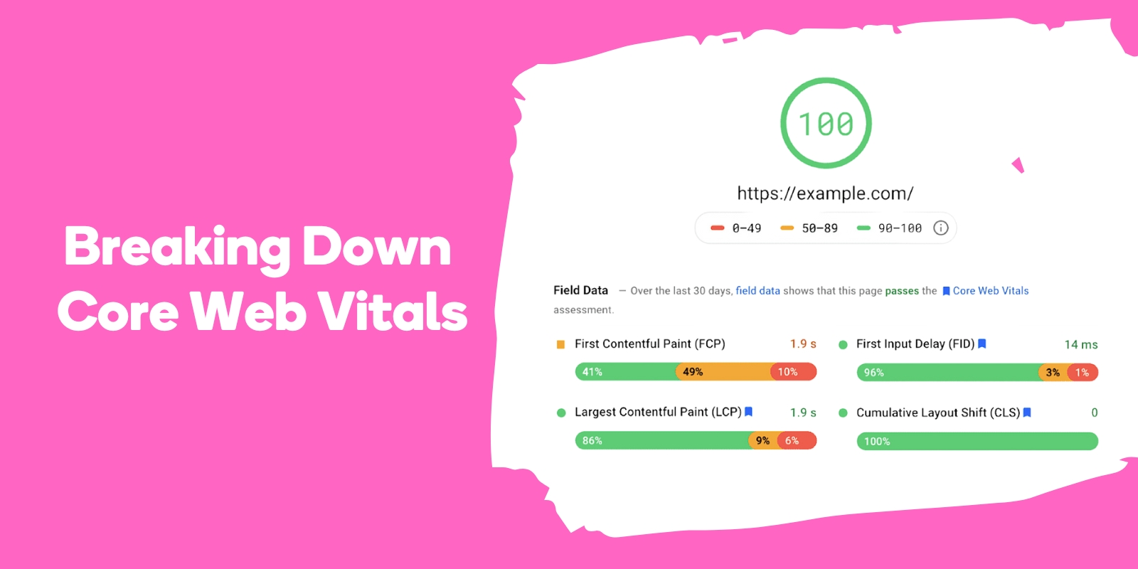
The three Core Web Vitals metrics are Largest Contentful Paint (LCP), Cumulative Layout Shift (CLS) and First Input Delay (FID).
These metrics measure how well a page is loading, navigating, and responding to user interaction and input. LCP measures the loading performance of a page, specifically the time it takes for the largest content element on the page to load.
CLS quantifies the visual stability of a page, measuring any unexpected layout shifts that occur during loading. FID evaluates the latency between a user tapping a link and the browser initiating processing of the action.
By focusing on these metrics, website owners can gain valuable insights into their site’s performance and identify areas for improvement.
Breaking Down Core Web Vitals
Now that we have a basic understanding of what Core Web Vitals are and their significance in the realm of SEO, it’s time to delve deeper into each metric and unravel their intricacies.
By analyzing LCP, FID, and CLS, website owners can identify strengths and weaknesses in their current website performance and make informed decisions on optimization strategies.
LCP, FID, and CLS are essential for SEO, as they can enhance a website’s visibility and ranking in web browsers.
High-quality user experience and fast page load times are vital elements for good search rankings, and Core Web Vitals play a significant role in achieving these objectives.
Let’s take a closer look at each metric and explore their importance in the context of website performance and user experience.
Largest Contentful Paint (LCP)
Largest Contentful Paint (LCP) is a metric used to measure the loading performance of a page, specifically the time it takes for the largest content element on the page to load.
Site speed is a vital element for rankings, thus LCP has a direct effect on SEO. A well-executed LCP can help webpages gain visibility in search engine results pages (SERP).
To ensure an optimal user experience, it is recommended to have a fast load time (usually within the first 2.5 seconds).
In other words, a fast-loading website will not only provide a better user experience, but also improve its search rankings.
To optimize LCP, website owners should focus on techniques such as image optimization and code minification, which can help reduce the time it takes for the largest content element to load.
By enhancing LCP, you can ensure that users are able to view the content they are looking for in a timely manner, ultimately leading to increased user satisfaction and improved search rankings.
First Input Delay (FID)
First Input Delay (FID) is a measure of a page’s interactivity, indicating the time it takes for a user to be able to interact with the page after it has loaded.
FID evaluates the latency between a user tapping a link and the browser initiating processing of the action. It addresses most of the potential blockages that could render your website unresponsive, however, it does not measure the performance of website processing.
FID is integral in assessing the user experience of web performance as it focuses on initial impressions. Google is set to incorporate FID as a ranking criteria for websites, emphasizing its importance in website performance and user experience.
To optimize FID, website owners should focus on techniques such as reducing JavaScript execution time and optimizing server response times. By improving FID, you can ensure a better user experience and potentially boost your search rankings.
Cumulative Layout Shift (CLS)
Cumulative Layout Shift (CLS) is a metric that quantifies the visual stability of a page by calculating the shifting of elements during the page’s download and render process.
It is a Core Web Vitals metric and has been included as a ranking factor since 2021. CLS serves as a measure of visual steadiness and its influence on user experience.
To optimize CLS, website owners should focus on techniques such as specifying dimensions for images and video elements, minimizing the impact of ads and iframes on layout shifts, and avoiding the use of dynamically injected content above existing content.
By improving CLS, you can ensure a more visually stable browsing experience for your users and potentially enhance your mobile search results and rankings.
Enhancing Page Experience Through Optimization Strategies

Armed with the knowledge of Core Web Vitals and their significance in search rankings, it’s time to explore optimization strategies that can help enhance your website’s page experience.
From improving page speed and interactivity to enhancing layout shift and other page experience elements, there are various strategies you can employ to optimize your website’s performance and user experience.
In addition to optimizing Core Web Vitals, it’s also crucial to focus on other aspects of page experience, such as content optimization, attractive CTAs, high-quality images, and white space utilization.
By adopting a holistic approach to page experience optimization, you can ensure your website is primed for success in the ever-evolving world of SEO.
Speed Optimization Techniques
One of the critical aspects of optimizing page experience is enhancing page speed. By reducing the time it takes for your website’s content to load, you can significantly improve user experience and search rankings.
Some effective techniques for optimizing page speed include minifying HTML, CSS, and JavaScript; optimizing images; caching; leveraging a content delivery network (CDN); and limiting redirects.
Compression is another essential technique for improving page speed. By compressing files or data streams, you can reduce the amount of data that needs to be transmitted, resulting in quicker page load times.
Enabling browser caching is also beneficial as it allows the browser to store some files locally, further reducing data transmission.
By implementing these speed optimization techniques, you can provide a faster, more enjoyable browsing experience for your users and potentially boost your search rankings.
Mobile-Friendly Design Principles
With the majority of online traffic originating from mobile devices, creating a mobile-friendly website is more important than ever.
Mobile-friendly design principles refer to guidelines for constructing a website that offers a consistent user experience across different devices.
By focusing on mobile performance and implementing strategies such as responsive web design (RWD) and image optimization, website owners can ensure their sites are primed for success in the mobile-first era.
When creating a mobile-friendly design, consider using a responsive design, optimizing images for mobile, utilizing a mobile-friendly font size, and avoiding pop-ups.
Additionally, ensure that your website’s navigation is optimized for touch interactions and provides clear, concise paths for users to accomplish their goals.
By focusing on these mobile-friendly design principles, you can deliver an optimal user experience across devices and improve your website’s search engine performance.
Ensuring Secure Browsing and HTTPS Implementation
In addition to optimizing page experience through speed and mobile-friendly design, it’s crucial to ensure that your website provides a secure browsing experience for its visitors.
Google emphasizes the importance of offering a safe browsing experience and has made HTTPS a ranking signal in its search algorithm.
HTTPS is a protocol for secure communication over the internet, providing protection for all activities conducted on the web, such as credit card numbers and passwords.
Implementing HTTPS on your website not only improves security and user confidence, but can also enhance your search rankings.
To ensure secure browsing and HTTPS implementation, it’s recommended to use an SSL certificate, enable HTTP Strict Transport Security (HSTS), and utilize secure cookies.
By prioritizing security and implementing HTTPS, you can provide a safer browsing experience for your users and potentially boost your search engine performance.
Tools for Measuring and Monitoring Page Experience

Now that we’ve explored various optimization strategies for enhancing page experience, it’s essential to have the right tools at your disposal to measure and monitor your website’s performance.
Several tools are available to help you assess page experience and track improvements, including Google Search Console, PageSpeed Insights, Lighthouse, ContentKing, Semrush, and Ryte.
These tools offer valuable insights and recommendations for optimizing your website’s performance and page experience. By leveraging these tools, you can effectively monitor your website’s progress, identify areas for improvement, and make informed decisions on optimization strategies.
Let’s take a closer look at some of these tools and learn how they can help you enhance your website’s user experience and search engine performance.
Google Search Console
Google Search Console is a free service provided by Google that assists website owners, developers, and SEO professionals in comprehending the performance of their site on Google Search.
It offers tools and reports to evaluate a site’s search traffic and performance, rectify issues, and enhance its Google search ranking further.
Google Search Console provides data on the website’s search rankings within Google’s organic search results, as well as Core Web Vital scores for all of its indexed pages.
By utilizing Google Search Console, you can monitor your website’s organic search performance and identify potential areas for optimization, such as optimizing page speed or improving content quality.
Additionally, Core Web Vitals scores can be utilized to identify areas of improvement in terms of user experience.
With this powerful tool at your disposal, you can effectively track your website’s progress and make data-driven decisions to optimize your site for success.
PageSpeed Insights and Lighthouse
Google’s PageSpeed Insights and Lighthouse tools are invaluable resources for evaluating your website’s performance and obtaining optimization suggestions.
PageSpeed Insights is a tool offered by Google that evaluates the performance of individual pages and provides scores and recommendations from Google developers to optimize website performance.
Lighthouse is an open-source, automated tool designed to enhance the quality of web pages. It evaluates performance, accessibility, progressive web apps, and other aspects.
By leveraging PageSpeed Insights and Lighthouse, you can gain insights into your website’s performance, identify potential areas for improvement, and obtain optimization recommendations such as reducing server response time, optimizing images, minifying JavaScript and CSS, and leveraging browser caching.
With these tools at your fingertips, you can effectively measure and monitor your website’s page experience, allowing you to make data-driven decisions and optimize your site for success.
Adapting to Future Google Updates

In the ever-evolving world of SEO, it’s crucial to stay up-to-date with the latest Google updates and best practices.
As Google continues to refine its search algorithm and introduce new updates related to page experience and user experience, website owners must be prepared to adapt and adjust their strategies to maintain a competitive edge.
With the right knowledge and tools at your disposal, you can effectively anticipate and adapt to future Google algorithm updates, ensuring your website remains optimized for success.
By focusing on user-centric design, optimization strategies, and staying informed on algorithm changes, you can continue to thrive in the ever-changing world of SEO and deliver a top-notch user experience for your website visitors.
Staying Informed on Algorithm Changes

Google makes frequent modifications to its search algorithm, with an estimated 500-600 alterations annually.
Staying up-to-date with these algorithm changes is essential to ensure your website remains in sync with the latest modifications and is optimized for an optimal user experience. To stay informed, it’s recommended to review Google’s official blog posts, monitor industry news, and subscribe to newsletters.
By staying informed on algorithm changes and their potential impact on SEO strategies, you can make data-driven decisions and adjust your optimization efforts accordingly.
This proactive approach will enable you to maintain a competitive edge in the ever-evolving world of SEO and ensure your website continues to deliver a top-notch user experience for your visitors.
Emphasizing User-Centric Design and Content
In the face of constant Google updates and evolving user preferences, it’s vital to emphasize user-centric design and content when optimizing your website.
User-centric design is an iterative design process that focuses on the users and their needs in each phase of the design process.
By understanding the user, their requirements, preferences, and experiences, you can optimize your website’s user experience and ensure it meets their needs and expectations.
Content is another crucial aspect to consider when optimizing your website for user experience.
By recognizing the user’s objectives and issues, as well as crafting content that is comprehensible and tailored to the user’s needs, you can create an engaging and informative website with helpful content that resonates with your target audience.
By focusing on user-centric design and content, you can ensure your website is primed for success in the ever-evolving world of SEO and delivers a top-notch user experience for your visitors.
Frequently Asked Questions
What is page experience update in SEO?
Page experience update is a collection of various SEO ranking factors from Google search, including mobile-friendliness, page speed, HTTPS security, and the like. It is designed to improve user experience by ensuring that webpages are secure, fast, and providing great content without intrusive ads or pop-ups.
What is Google’s page experience update?
Google’s page experience update focuses on improving user experience across its search engine by creating a more efficient, secure and interactive online environment. The update includes several Google ranking factors such as the mobile-friendly update, Page Speed Update, the HTTPS ranking boost, the intrusive interstitials penalty, and safe browsing penalty.
Google is dedicated to providing users with a reliable and accessible online experience, making it an invaluable resource.
What does Google look at for SEO?
Google looks at a variety of elements when deciding how to rank pages and websites in the search engine results page (SERPs). These include relevant content, site structure, user experience, and keywords.
By optimizing page content in these areas, websites can improve their visibility and searchability on Google.
What is Google core update in SEO?
Google’s Core Updates are comprehensive changes to the search engine algorithm, typically rolled out a few times per year. These updates focus on improving the quality and relevance of search results, tweaking existing ranking signals such as content quality, user experience, and backlink profiles.
Google provides advance notice of core updates to help SEO professionals and website owners adjust their strategies accordingly.
Conclusion
Throughout this comprehensive guide, we have explored the intricacies of Google’s Page Experience Update and its impact on website rankings and user experience.
We dove into the world of Core Web Vitals, breaking down each metric and their implications for SEO.
We also examined various optimization strategies for enhancing web page experience (page experience report) and provided an overview of the tools available for measuring and monitoring website performance.
As the digital landscape continues to evolve and Google introduces new updates and ranking factors, it’s essential for website owners to stay informed and adapt their strategies accordingly.
By focusing on user-centric design, optimizing Core Web Vitals, and employing the insights and tools at your disposal, you can ensure your website remains optimized for success and continues to deliver a top-notch user experience for your visitors.